The Teenage Sex and Death at Camp Miasma Production Designers Unpack Their Slasher Fantasy World
From VHS covers to matte paintings, Brandon Tonner-Connolly and Matt Hyland break down their work on Jane Schoenbrun’s queer meta slasher
by Lana Thorn 22 August 2026
MUBI
Teenage Sex and Death at Camp Miasma, the latest genre-bending queer horror feature from I Saw the TV Glow director Jane Schoenbrun, follows an indie queer filmmaker, Kris (Hannah Einbinder), hired to revive the Camp Miasma series, a problematic slasher franchise now regarded as “zombie IP”. When Kris travels to meet the original film’s final girl, Billy Presley (Gillian Anderson), now a recluse living in the abandoned summer camp where she shot the movie four decades ago, the pair fall into a dizzying psychosexual romance that tests the boundaries of their reality.
Like TV Glow, Teenage Sex and Death at Camp Miasma is a film existing across different worlds. For production designers Brandon Tonner-Connolly and Matt Hyland, that meant bringing to life the snowy, dreamlike camp setting where Kris and Billy fall in love, as well as visualising the film-within-a-film for when the women watch Billy’s print of the original Camp Miasma. But in addition to those responsibilities, in what Tonner-Connolly terms a “side hustle”, the duo had to flesh out a 40-year-old franchise with a range of memorabilia that populates the opening credits sequence, from VHS covers to reviews, a board game, and a wind-up toy of the franchise’s killer, Little Death (Jack Haven).
Calling Phantasmag from New York and Chicago, respectively, Tonner-Connolly and Hyland discuss reviving the practice of in-camera matte painting backdrops, taking inspiration from Bram Stoker’s Dracula, and how it feels for their fake movie merch to become real-life collector’s items.
MUBI
Phantasmag: What were the initial conversations that you had with Jane about the film?
Brandon Tonner-Connolly: I worked with Jane on TV Glow, and that was such an incredible experience. They sent me the script for this film, and we had lunch at the same place in Brooklyn where we had an early lunch on TV Glow. One of the things we talked about was the matte paintings, the painted backgrounds. Another was the colour and quality of the blood. Initially, they were talking with Eric [Yue], the cinematographer, about the blood colour being like the black on a black-and-white cookie, or the blood [recalling] 90s movies versus early 2000s movies. Then, we talked about candy, which was a big deal. We're both lovers of candy, and seeing that in the script, I think my parting words were like, ‘But what kind of candy?’ Those were three topics we hit right off the bat.
Also, they impressed upon me that the movie is about pleasure. Whereas TV Glow is one element, this is about having those feelings of joy and pleasure in your body, and not some gross, gore-fest slasher film.
P: What about you, Matt?
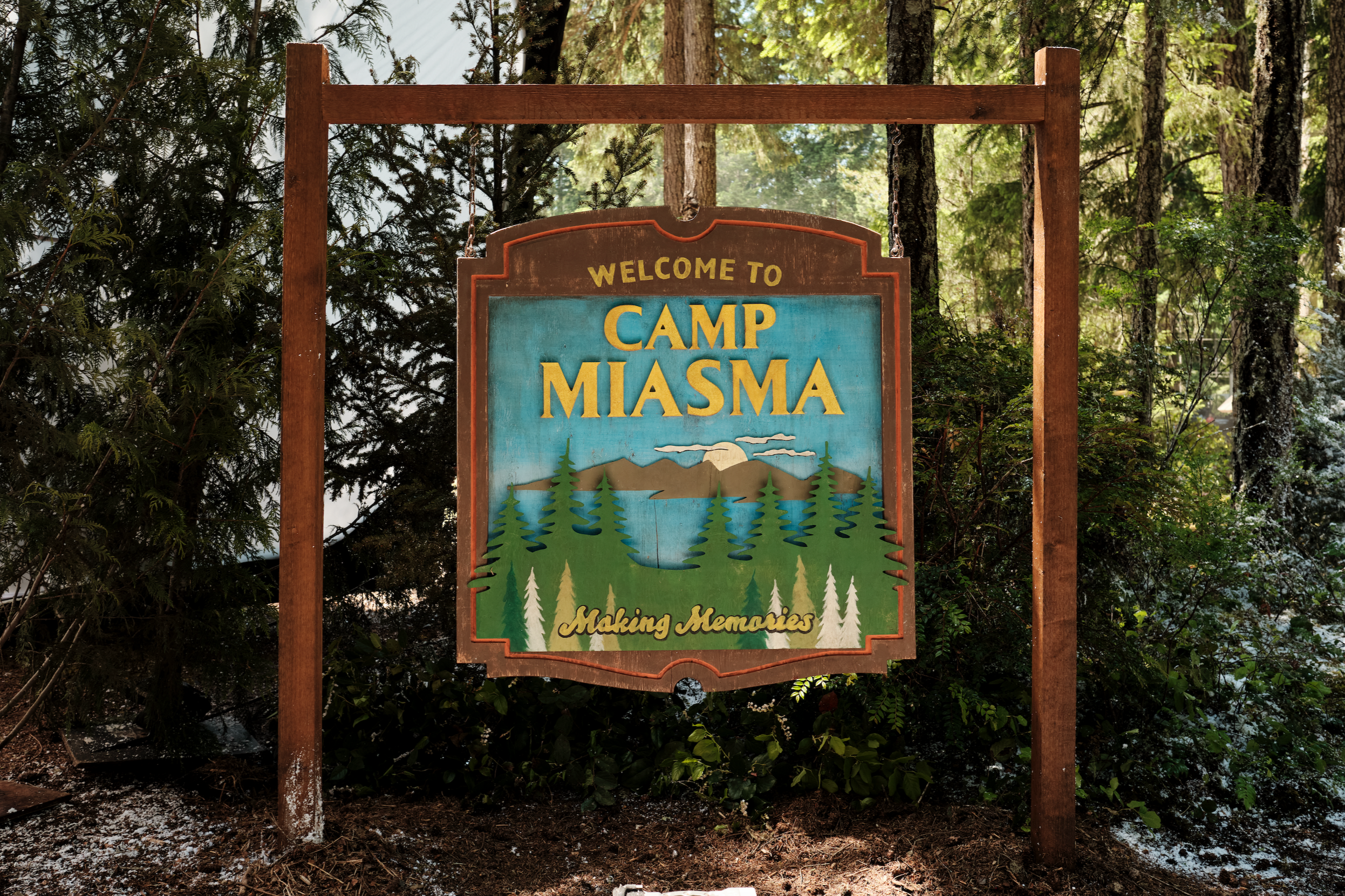
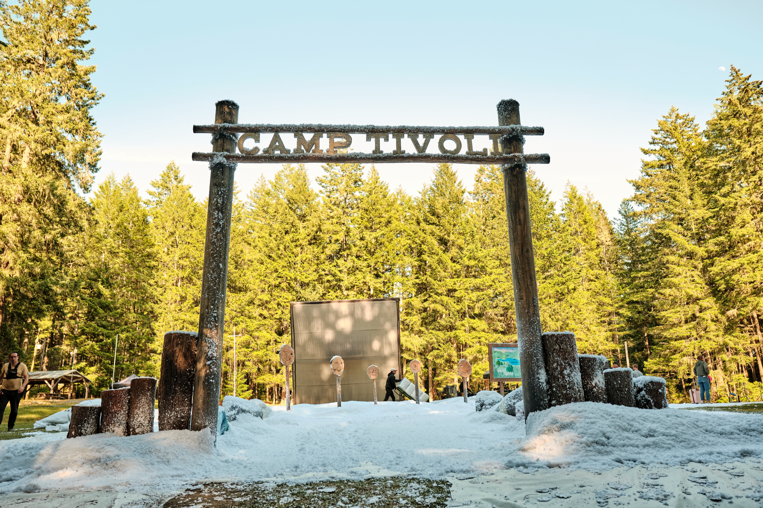
Matt Hyland: We had a bit of a staggered start. When I joined the conversation, the script was in a healthy place, but we just had no world yet. It was a quest to find where Camp Miasma could be. We ended up looking in Vancouver, and from there, Vancouver Island, and after about a week of scouting, we decided to plant the flag there and build out all the different locations. It's a primarily location-based shoot, so that's where a lot of key decisions get made early on.
MUBI
P: Did you have a mood board for the film?
BTC: I love a mood board. I love a reference deck. For this one, and it was a similar process on I Saw the TV Glow, Jane came into it with an incredible reference book of 500 or 600 images that spoke to costume design, cinematography, production design, blood quality, and just the general tone. They start in a very well-studied, well-researched place with this process, and that always helps. I was able to take that and run with it, and then especially with the opening credits sequence, that was hours and hours of research looking at different fan conventions and people’s home collections in their basements. So we have individual mood boards for each set and each topic, and I love to put them up in the production office. That way, when you’re on your way to the kitchen, you have to walk through this world of “flesh palace” [the liminal video store where Little Death lives] references.
P: I heard that Bram Stoker's Dracula was a reference point. What was it about that movie specifically?
MH: That was among a cluster of really classic, mostly Hollywood films that were speaking to the romance. The primary point of entry was their matte paintings. It incorporates them and approaches them differently, but they are some of the best that have been made. They’re incredibly sophisticated and beautiful pieces of art — that’s where it came in initially — but that film also has a really nice quality of snow and this lovely Gothic, romantic quality. A lot of horror films don't really dabble in that, so that was an important emotional touchstone for this movie to keep the internal character in mind and not just spectacle.
BTC: For me, watching it, that Dracula is kind of about Francis Ford Coppola's love of film and the illusions that film exists in. It seemed fitting to look at that and take it as an inspiration for our own magic tricks.
MUBI
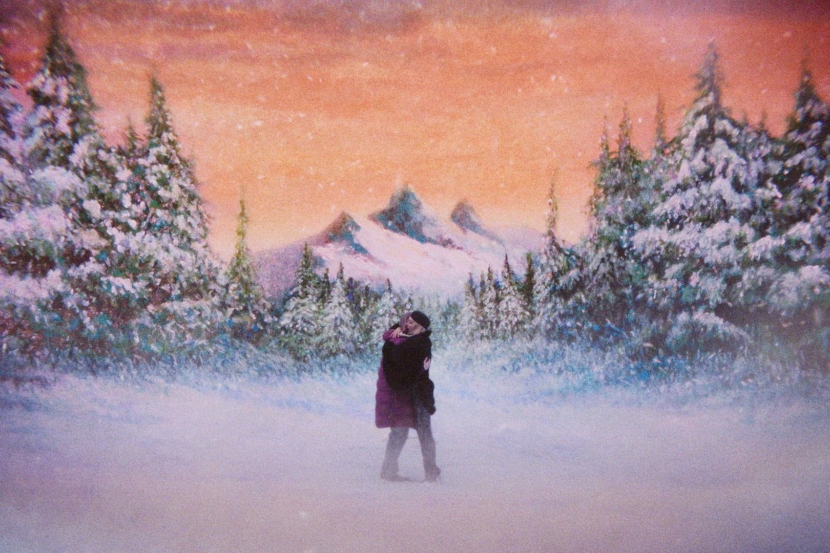
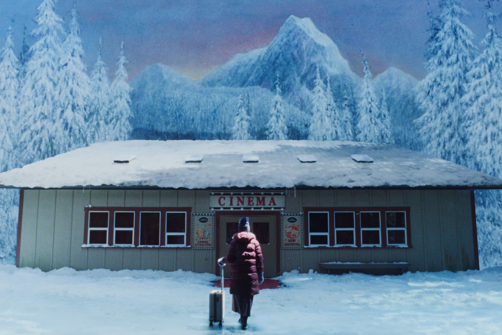
P: Speaking of the matte paintings, you’ve revived this old-school technique. Why did they feel like the right fit for the film’s visual language, and can you walk me through the practicalities of those shots?
BTC: Again, that was one of those really early conversations with Jane. This Japanese horror film called Kwaidan was a reference, where they’re shooting scenes that are supposed to be set in a forest or by a lake, but they're all things that they built on a stage. That movie ended up bankrupting the studio that financed it because of how crazy the set pieces were. So I was like, ‘Maybe let's not tell the producers that that's like an inspiration for us.’ The idea was to have this environment that is knowingly cinematic, that has this knowing artificiality to it. Not just because we wanted to use an interesting technique, but because we wanted to make these beautiful landscapes that brought you into the emotional landscape of the characters.
We wanted to have these intentionally dreamlike visuals that act as portals to this fantasy world of play that Billy has constructed. It’s almost like Kris is stepping through the portal and into her artwork. It starts with this distant cityscape that's outside of Kris’ hotel room, and then you find Kris getting more and more incorporated into the painted backdrops until they’re fully enmeshed in it in the end and walking through it in that final summer backdrop sequence.
I know Willy McGee, who's one of the producers, likes to say that Jane's movies focus on the idea of portals and stepping into a new space, and whether that space is comfortable or uncomfortable. In this case, the painted backdrops were about Kris stepping into this storybook romance, into this almost Bram Stoker's Dracula-type world. But conceptualising it was a lot easier than making it happen. That involved a lot of collaboration with Eric Yue and the VFX folks at Niche. But I'll let Matt speak to the specifics.
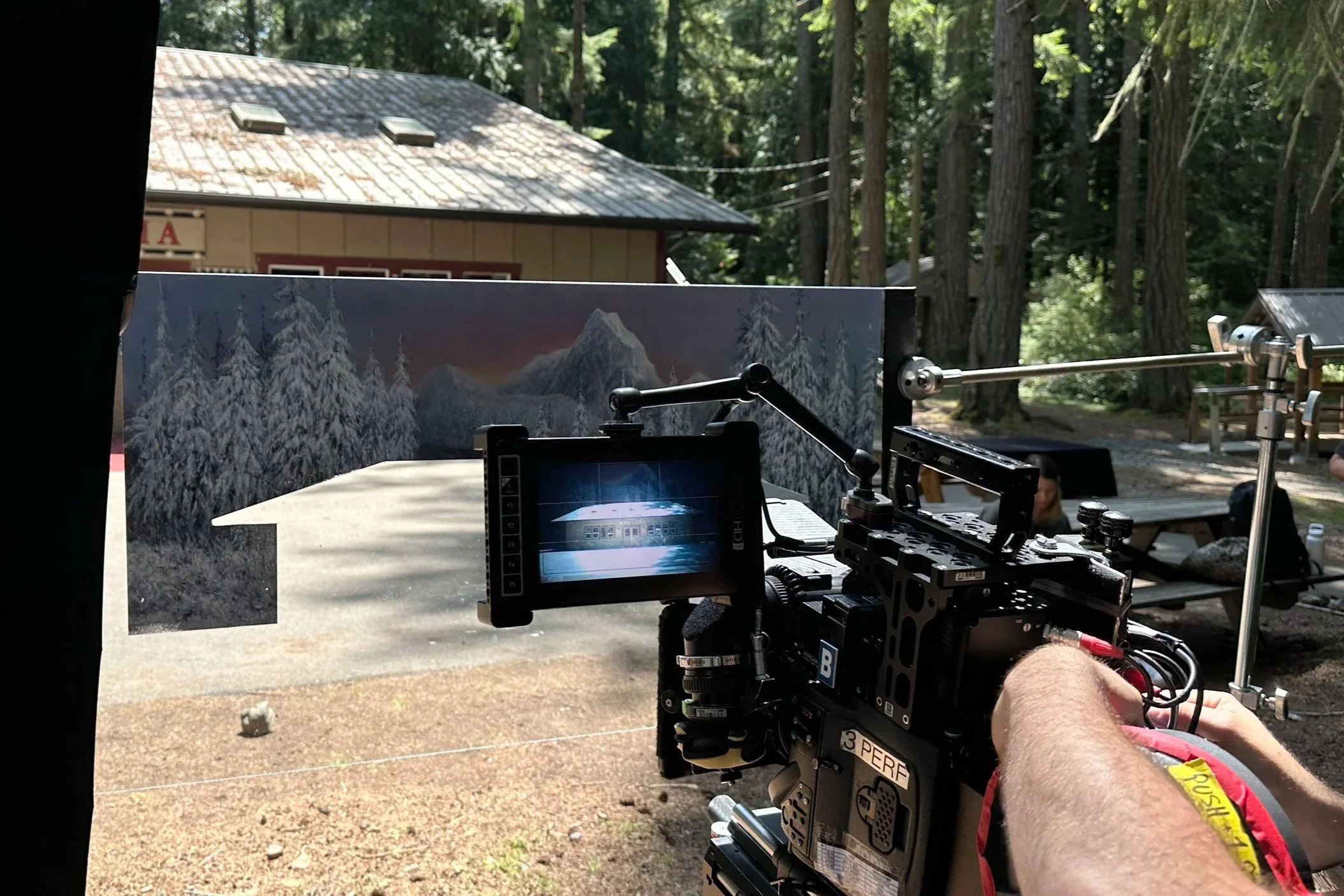
Capturing the in-camera matte painting trick. Courtesy of MUBI.
MH: Well, necessity is the mother of invention, but I’m not sure if that applies. We didn't exactly invent anything here — it’s just that we didn’t have the ability to follow the process and workflow used in a lot of these seminal films. They take a lot more time. They have separate units. Sometimes there's a lot of studio or stage components. So we had to research enough to borrow what would work and then just make up our own more independent style that would actually be shootable on our timeline.
We had to set targets weeks and weeks in advance, so while Jane and Eric are off in prep storyboarding, we're off doing research on the location and the optics and the mechanics, and trying to find our painter. And then mechanically, it’s very simple. It’s a camera pointing at your actors and your scenery like any other normal shot, but the difference is you put this piece of glass a few feet away from the camera. Mostly, you see right through the glass as if it’s not there, but as you selectively paint imagery on it, from just that one vantage point of the lens, you start to create a live, in-camera blend of the painting — the fantasy world — and the real world.
That trick changed our workflow. It meant other things in the movie benefited because we had to stay so close in communication. And there was a real sense of anticipation building to it because it was later in the shoot. Truth be told, there was no way — the way we were doing it — to verify that it would work ahead of the day. So we did all the prep and crossed our fingers that it would actually work once Hannah Einbinder walked into frame in costume.
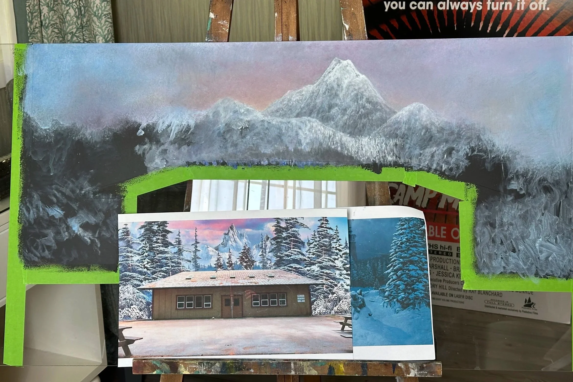
A matte painting in progress. Courtesy of MUBI.
P: You touched on this a little, but can you tell me more about the research involved in making all the memorabilia for the opening credits sequence? How did you go about creating a fake 40-year-old franchise?
BTC: It was so much fun [laughs]. It was a real dream. Jane wanted to tell the story of the franchise immediately, while pulling the audience into the camp setting and setting up the expectation of fun — the pleasure of looking at these objects. The idea was to create this nostalgic excitement, this feeling that you had as a kid on Halloween, or at the video store on a Saturday. In the script, Jane had actually written something like, ‘Our movie has an awesome opening credit sequence.’ So the bar was set pretty high, and we had to dive into the research quite extensively. I had different researchers just find every single bit of paraphernalia from Friday the 13th, A Nightmare on Elm Street, Halloween, Child's Play, Sleepaway Camp, or any kind of horror franchise. If they made a piece of merchandise or gave something away at a screening, then I wanted an image of it.
So we gathered all of that together with Jane and Sepi [Mashiahof], who worked closely with Jane and is an amazing creative force in and of themselves, and we started to form this bible with the chronology of the Miasma franchise. So we had this whole list. Camp Miasma 1, 1983. Here's the director, here's the tagline, and so on… and then we broke it down in different creative periods. There are the early movies when it’s kind of dangerous and grindhouse and maybe genuinely trying to make quality work. Then there’s the mid-Miasma period where you’re cashing in, but there might be a good director who wanders in and tries. Finally, there’s the late Miasma period where they’re in space or time-travelling, and it’s just a straight-up cash grab. The quality has gone through the floor.
Once we had that, about a week before we started shooting, Janes gathered us, Eric, Willy, and Sepi in their office — no cell phones, close the door, 12 Angry Men style. Nobody can leave until we map out this sequence beat for beat. And each beat was a different object that we had to fabricate. That was probably one of my favourite experiences of the entire film, just being locked in this room with these people who I really love, working out the story of each object and how we were going to hook people emotionally into the rollercoaster ride of the Miasma franchise. Eric came out of it with an incredibly specific shot list, which itself is a work of art. It should be framed in a museum.
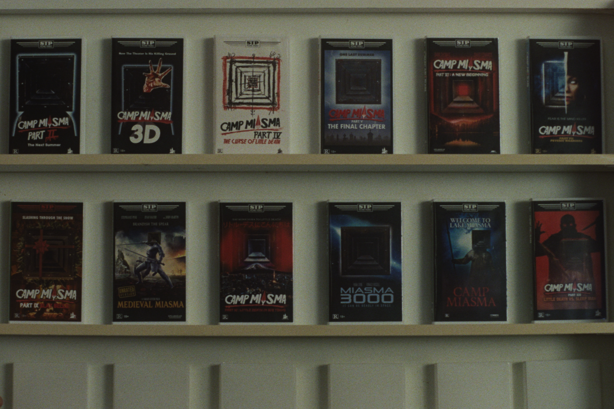
MUBI
The entire time we were making the movie, we had this side hustle of making the Miasma merchandise. It was like, ‘How is it going with the VHS and the alarm clock?’ It felt like we were gonna sell this stuff out of a trunk at some point. The Halloween costume took a minute because we kept making the quality too high. We needed to go back and just think, How do we make this more of a knockoff?
Then the reviews are my favourite part because it was great to collaborate with Jane on the larger points and then with Sepi on the taglines and some copy. We were having fun and making sure that there were small details and in-world jokes where, if you read through the text, it refers to other things in the Miasma franchise. Then we put that — I think it’s Miasma Part VI — won Best Special Effects that year. We said that Kyle Moore won that, and he's the special effects coordinator for our film.
MH: This movie is such an embarrassment of riches, and that sequence by itself is probably more fun and more fabrication than we get to do in whole projects or in a couple projects combined. Like Brandon's saying, it was a bootleg operation going on the whole time we were filming. And a lot of that stuff was our childhood, whether it’s WrestleMania or G.I. Joe, these tactile objects were a real way, as we were growing up, to mark our interest in these things.
It was really cool to make our own version of that and invent the memories behind the objects. It’s the kind of filmmaking and storytelling we would have dreamed of when we were younger. But it was a mad dash to get it done by the end of the shoot, and we wouldn’t have been able to do it without knowing from Eric how these things were going to be shot, and what Jane needed from the rhythm and the tone of it. Some things are played for laughs, for example. In some cases, Niche, our VFX company, helped us complete them because we'd have elements like the video game and key art photos.
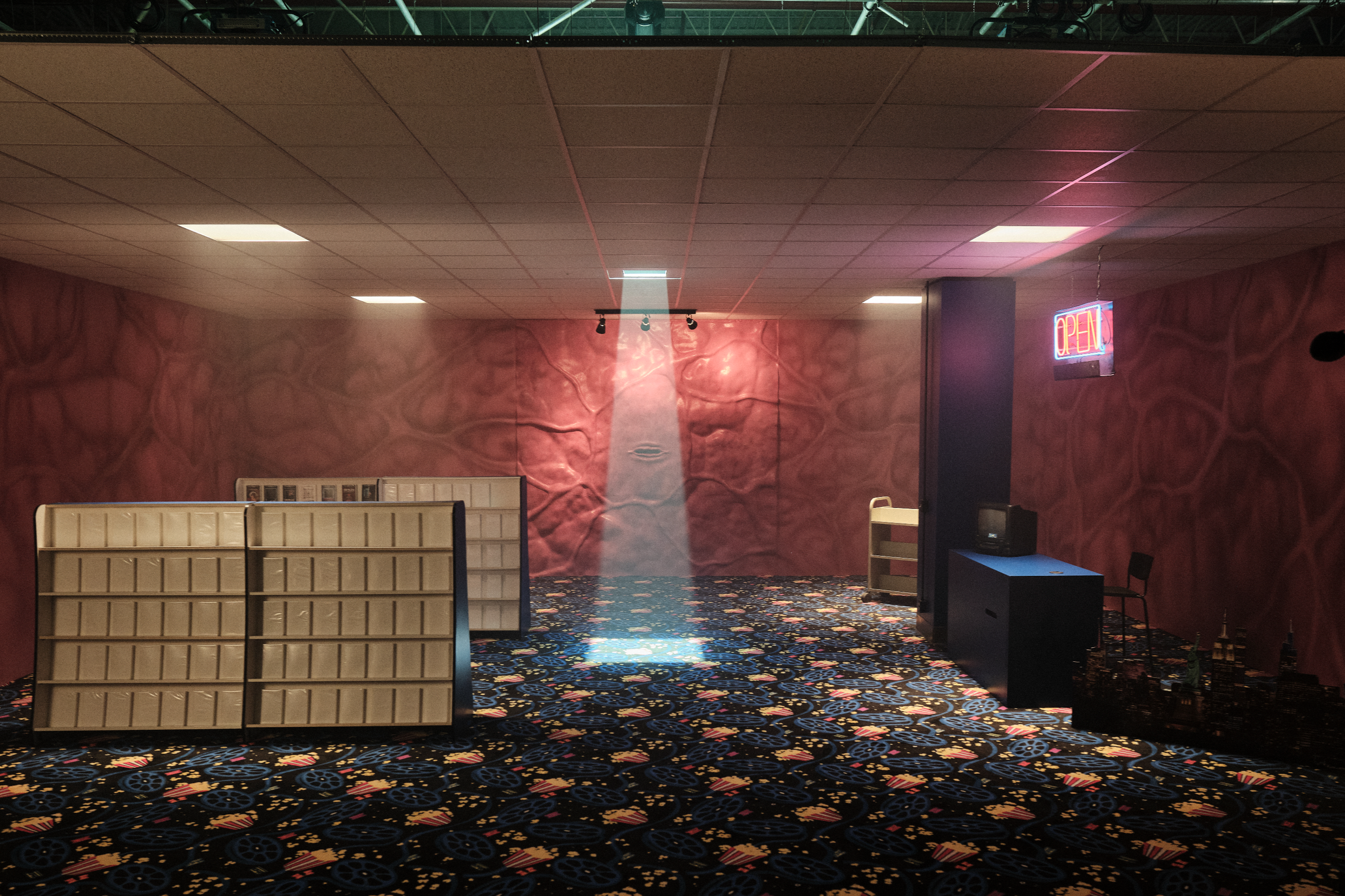
MUBI
P: The “flesh palace”, where Little Death lives, is such an eerie, standout set. What was the vision for this specific location that crosses a video store with the human body?
MH: What’s not to understand?
BHC: It’s just your typical flesh palace [laughs]. No, the first thing we talked about was the texture of the walls. We were thinking about that moment in A Nightmare on Elm Street Part 3 when Freddy rips his shirt open, and he has all these souls stuck within him on his skin. We were wondering if we wanted something gorier, something more realistic, or even something closer to bubblegum than actual flesh. We worked with a concept artist and nailed the flesh tone down, and then we thought, Could it be something that feels more like a theme park ride? Like, if you were to take a theme park ride through an intestine or that sort of thing.
Then we talked about what Little Death would actually have in there to pass the time. We came up with the cardboard cutout of the New York City skyline, just because maybe that’s some place Little Death would look forward to visiting, or was a souvenir they took home from Little Death Takes Manhattan.
The last major creative piece was the flooring. We looked at checkered tile and all these other things for liminal spaces, but then I had this idea that it should be a movie theatre carpet. Again, something that would promote this feeling of nostalgia and the excitement about those objects of youth. It had to be this one really perfect carpet, which meant we had to get it flown from Atlanta to Vancouver on a really tight timeline over the border and everything. It's probably the most expensive single thing that we got in the movie. There were questions of, ‘Do we really need this specific carpet?’ And I was like, ‘Yes, we really need this specific carpet.’
MH: It had the right blue; it had everything.
MUBI
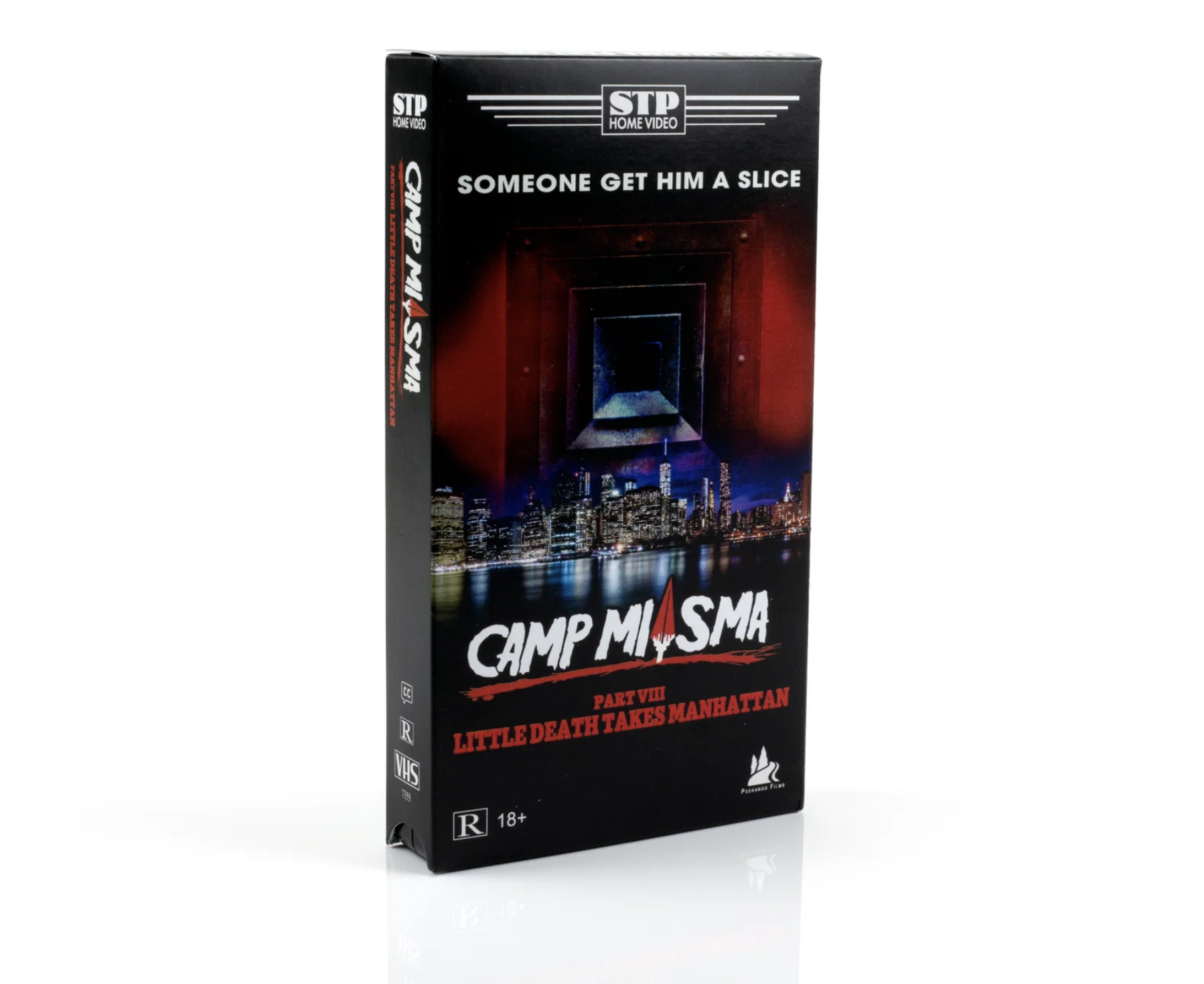
BHC: A lot of what we’re playing with in the movie is these experiences from when you first watched these slasher films as a kid, where you have these memories and half-remembered fragments, and I felt like this carpet really set off this explosive sense of emotion. And then it was a really fun scramble to make the VHS covers in time and come up with all the taglines with Jane and Sepi. I wish we could make some T-shirts of those. Like the tagline in Little Death Takes Manhattan: “someone get him a slice”. There are so many great little moments in there.
MH: There’s an incongruity to the film which is part of the fun: sex and violence, death and love. There are all of these contrasts, and the flesh palace was a really fun space to play with because you would assume that this creepy, nasty place would make you feel miserable, but the challenge was to have a bit of brightness and adventure in there. Overall, as fans of the genre and collaborators with Jane, it was just so much fun to chart our course through a new type of slasher movie that was asking for more than just scares.
P: Like with the fictional TV show The Pink Opaque in I Saw the TV Glow, this film spends time in the world of the original Camp Miasma movie. How did you decide on the look of the film-within-the-film?
BTC: When I was speaking with Jane about The Pink Opaque, they were very clear that it didn’t have to look like 90s TV shows. We didn't have to be faithful to those exact design decisions, but instead, it needed to look and feel like the memory of watching them. It needed to evoke those moments of what it felt like to escape into this world as a kid. That was so powerful to me, and with the original Camp Miasma movie within our film here, it was a similar approach where we wanted to rely on those fragmented memories of childhood and those images and scenes that are remembered and misremembered, and all of the emotion they hold for people. We wanted to tap into a younger experience of watching these things for the first time and to unlock those emotions that speak to the language of the period and the genre without necessarily retreading familiar territory.
MUBI
Then, as research, we watched Crystal Lake Memories, which is this seven-hour doc about all the Friday the 13th movies. We looked at photos of the original shooting locations from every movie, and you could imagine what they had done to change those original locations for their films, and just started to understand the language and the grammar of it, so that we could really play with that ourselves.
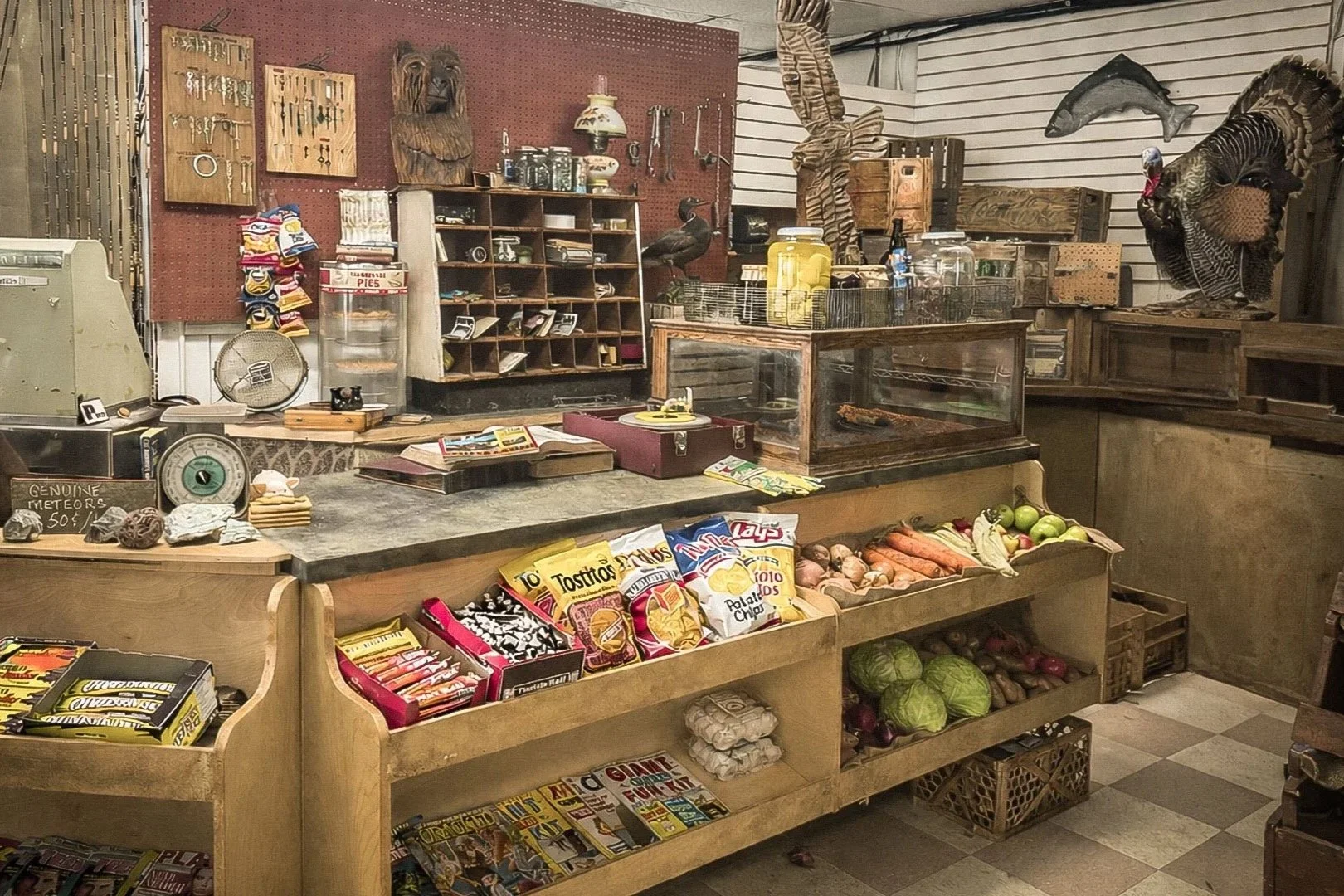
The wonderful thing about collaborating with Jane is that there's no easy way of sorting out the different worlds. It’s not as if, ‘This is the original Camp Miasma film, so the colour palette should look like this, and there shouldn't be anything that looks like this.’ That's a fun little bubble to be in, when you can spend hours every day talking with somebody about a particular item that's going to be on the countertop in the country gas station. For me, it's all about the details, and Hana Cook, our set decorator, did an amazing job in bringing those details to life.
It’s important to me that Jane and the actors are able to walk into the space and for everyone to feel lost in the world, for Patrick Fischler to stand behind the register and get lost in the details of the character. We put so many fun things in there, like a View-Master thing that Hana had found in this crazy roadside store in the middle of nowhere on Vancouver Island. Patrick played with all those things and came up to me after the take and was like, ‘Oh, have you seen this thing? This is amazing. So I guess my character, when he’s not freaking out teenage kids, he stands there and checks into this alternate world.’ That’s the philosophy, and it’s how we make a lot of the design decisions.
MH: Yeah, and sometimes it’s the wardrobe that’s helping establish period. Because we don’t rebuild a house every 10 years — some things stay the same. So we knew whatever we were doing had to be in harmony with what they were doing too. And there was a lot for us to discover on Vancouver Island. The old gas pumps and older cabins and signage lent themselves to the world.
MUBI
P: What’s your favourite piece of memorabilia that you created for the film?
BTC: I love the VHS boxes because there’s so much detail, but I’m gonna choose two things. One is the board game because you can actually play it. I brought in a graphic designer I’ve worked with before, Jessica Sanchez, to complete that. She went ahead and made an instruction manual and everything, and Jane ended up shooting it. Then the New Yorker cartoon is another one that I love, which plays at the end of the opening credit sequence. That’s one of those things where not everybody finds it funny, but I personally find it very funny. When I do hear people laughing in the theatre, it gives me a great sense of joy.
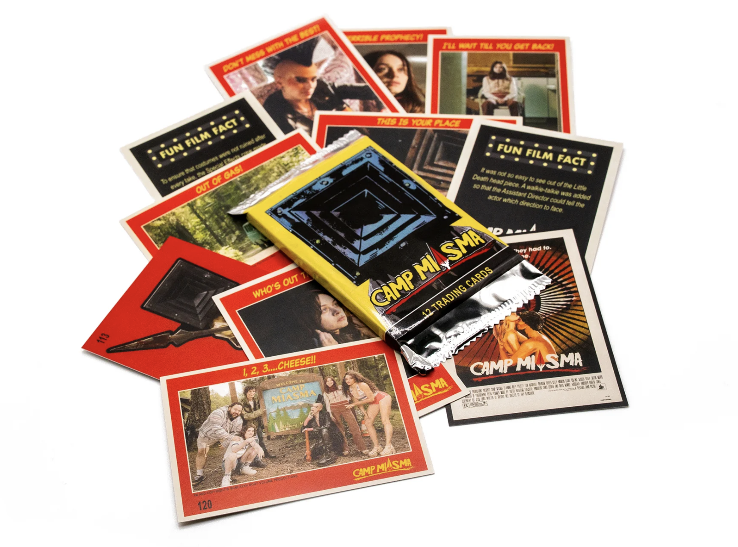
MH: Mine are the trading cards, for sure. That was my gateway into movie fandom as a kid. And as simple as they are, it took quite a bit to pull those together.
P: It’s great that they’re selling them now.
BTC: It’s pretty surreal and unexpectedly emotional that these objects we created as an homage to real-world franchises are now, in and of themselves, becoming things people collect. It’s amazing that people are coveting them the same way we would a Friday the 13th trading card from the 80s. The only thing we didn’t get to do — I really wanted to have one of those sticks of pink gum that were included in the trading card packs from the 80s and 90s, which nobody ever chewed ‘cause they were so hard.
Teenage Sex and Death at Camp Miasma is now playing in US and UK cinemas.